The Boswyck Farms Hydroponic Coursebook gets a facelift.

For almost two years now, Boswyck Farms has been offering a one-of-a-kind Hydroponic Certification course. We’d been printing the book in house but for our first course of 2014, the course book was sent off to be printed and spiral bound.

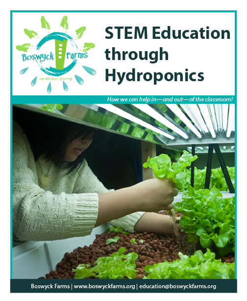
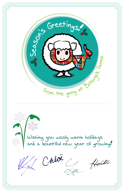
While I can’t give away the trade secrets inside (for which I did the layout and several hydroponic system drawings), I can show off the new front and back covers as a tease. Back cover copy provided by Chloë Bass.
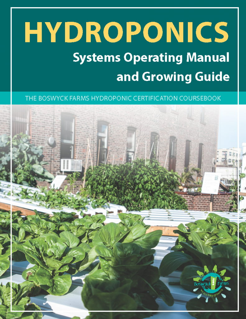
front cover

back cover

All About Boswyck

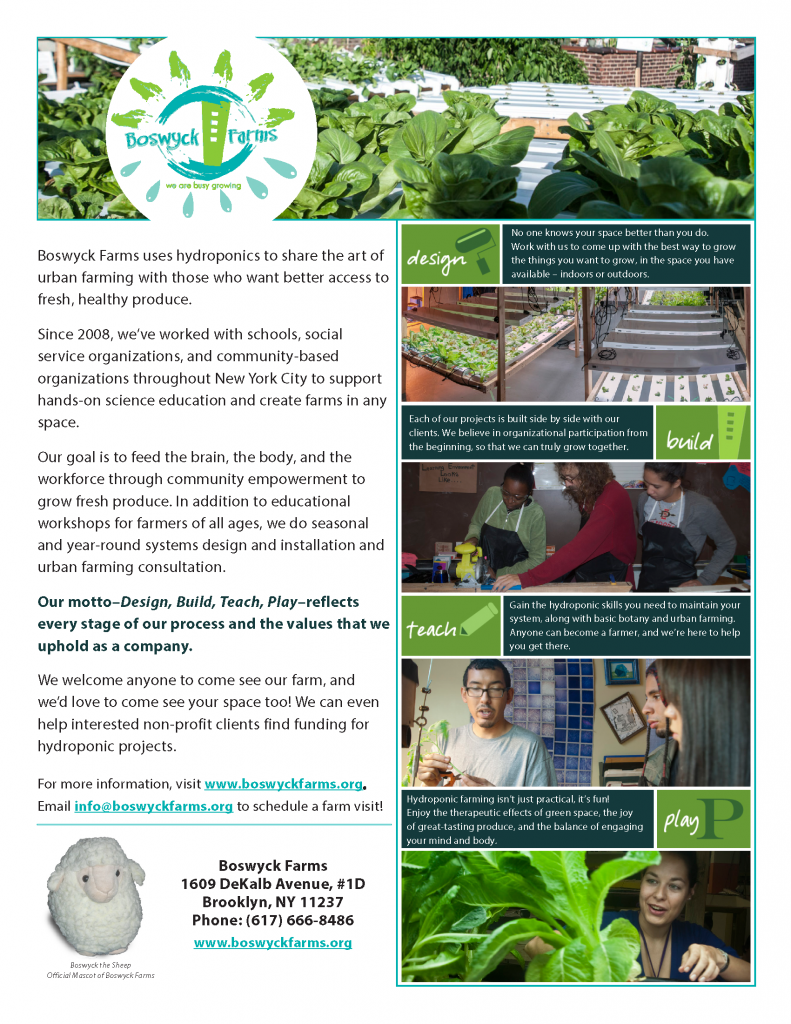
2013 was the year where we amped up our public face and marketing materials. I designed this info sheet for Boswyck Farms, using artwork (the Design. Build. Teach. Play! elements) and company logo originally created by V Van Sant.

new information sheet

Fundraising with Food

In 2012, Boswyck Farms partnered with EcoStation:NY on the Bushwick Campus Greenhouse Project. I created this design for a fundraiser where local eateries agreed contribute a percentage of their revenue on the day of the event to the project.

eat-to-give-logo copy

Young Men’s Leadership Camp: The Metal Elective

In the second year of my Peace Corps service, I ran a week-long summer camp along with 3 other PC volunteers. During the day, young men aged 13-18 would attend a rotation of classes on Democracy, Service Learning, Life Skills, Health Training (from Red Cross), and of course, Outdoor Activities.

For their evenings, students had the option to choose from a bunch of “electives”: stand-alone topics that one or two Peace Corps volunteers would teach, centered around a passion or hobby that they could share. My friend David and I chose Metal. It went over so well that we did an encore session for students who missed it the first time.

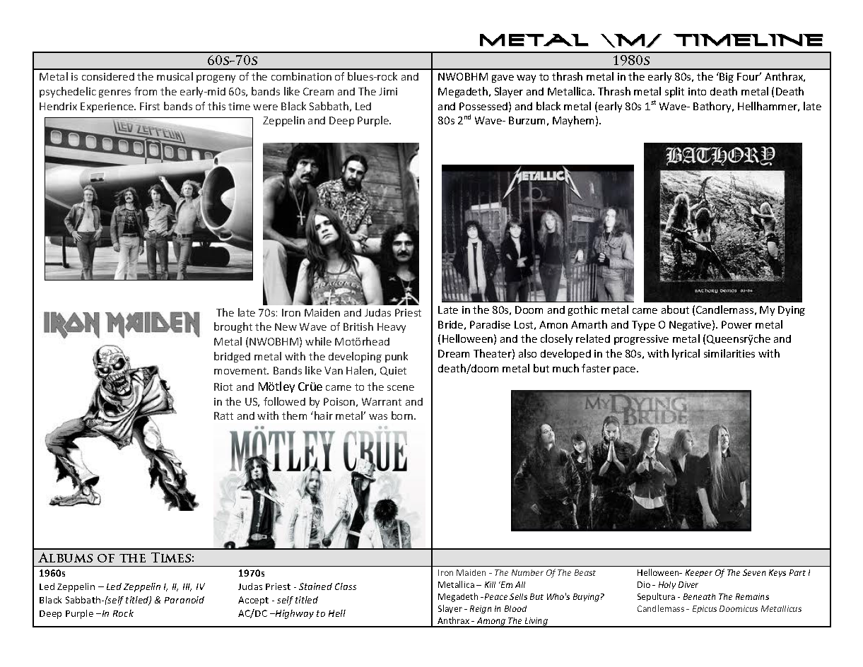
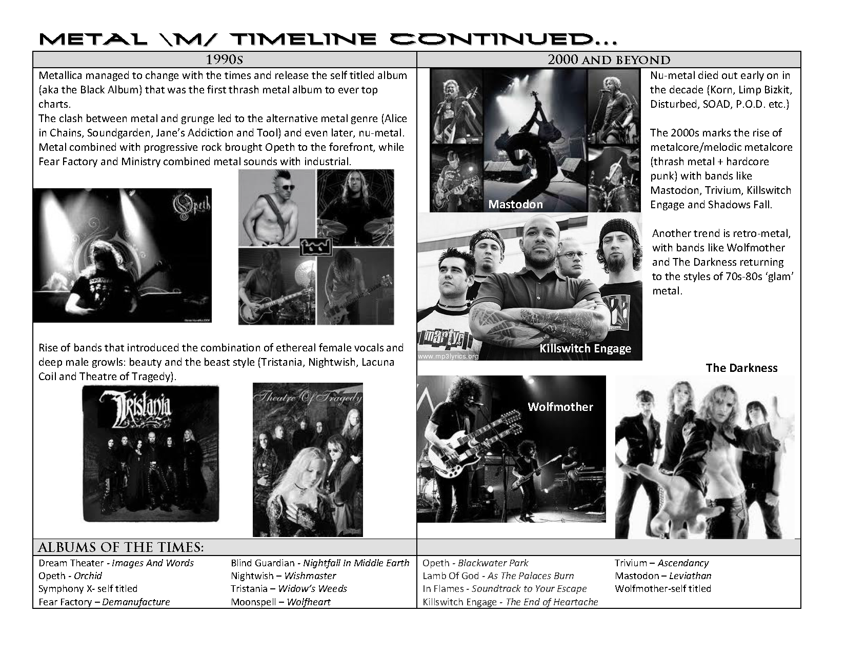
While not the most polished piece I’ve ever done (rush job for sure) and admittedly cheesy, I still really enjoy the Metal Timeline I created for that elective:

METAL TIMELINE_Page_1

METAL TIMELINE_Page_2

Cycle Macedonia

Two friends in the MAK 13 Peace Corps group were trying to get Macedonia on the map for adventure tourism. They plotted out a gorgeous route through some of the secretly awesome areas of the country that most tourists pass over for the overt beauty of Lake Ohrid. And thus, Cycle Macedonia was born. I designed this logo that was used on the website and t-shirts for participants, and am excited that Cycle MK is still going!

cyclemk-01

Skopje Squirrel Charity Tournament

The Skopje Squirrel event was a clothing drive/basketball/soccer tournament, all volunteer-run on a budget of $0. It worked thanks to a lot of generous donations and a host of local student and Peace Corps volunteers.

“Why a squirrel?”, you may wonder.

We were hard pressed to find a better S animal. Salamander? Snake? We were also conscious of the fact that it had to sound reasonable catchy in Macedonian too. Squirrel it was.

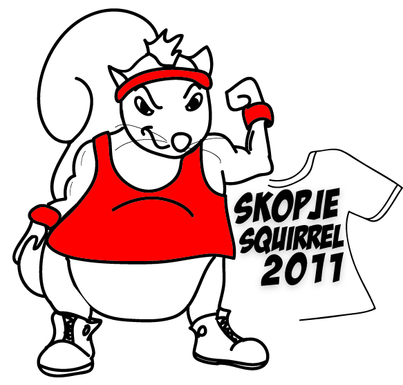
So I drew up this beefy squirrel dude to represent.

official skopje squirrel logo 2011

Bonus:

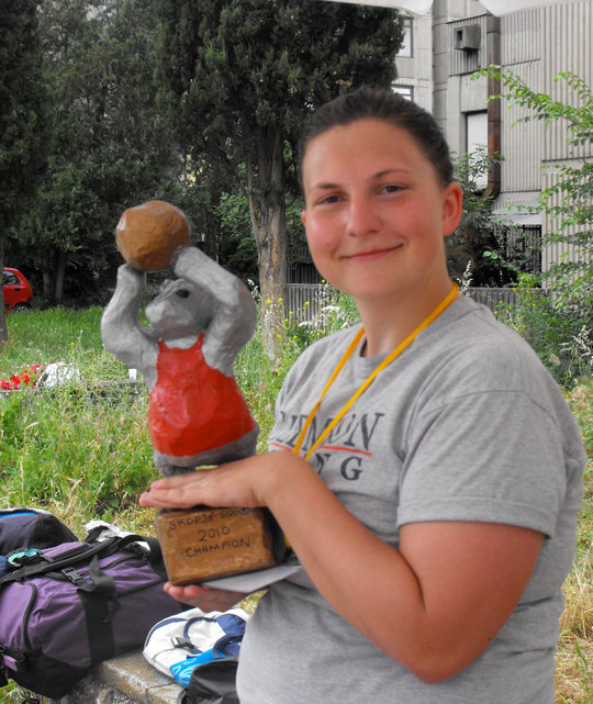
I also made 3 trophies for the event winners from paper mache, to match our logo. (Very serious about that budget of $0). Here I am with the Bronze Medal Trophy Squirrel before it was awarded to the winning team:

 me with squirrrel